Friday, 8 December 2017

Digipack Title Ideas

These are some of the title ideas that we came up with as a group, we are going to ask some of members of the target audience what they think the title of the album should be and make a final decision regarding the feedback.

Brand identity - Digipack

These questions will help us to gain an understanding of how we want our digipack to be perceived, it will allow us to create a strong brand identity that is represented through all of our ancillary products.


Name of the artist?


The name of the artist will be her real name, Holly Bennett. We think this will help people see that she is real and the things portrayed in the music video and through the album is all real and all her.


Colour decision?


The colour combinations will be silver, grey and a light pink. This is to make reference to both the song lyrics and the name of the album. The colour pink adds a brighter colour and a element of femininity.


An idea on the overall concept - What is the album about? How will we show this?


The album will be about the ability to change and having the ability to move on. The colours we have chosen should help to get this across with the grey turning silver be a reference to this. We also want to include a soft pink to emphasise the femininity of the actress.

How does this link to the audience?
This links to the audience as it allows them to move on and the album will allow the audience to reflect on how they could change like the girl has, the names of the songs in the album will take the audience on a journey and help them to relate to the songs and the album as a whole.
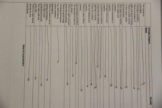
Magazine advert analysis


Audience feedback on album names


This is a short clip with our target audience feedback about the name choices for the digipac and the magazine advert, from the feedback we will decide on the name we think best fits the genre of music and the style of the artist, while taking into consideration audience feedback.

Final idea for the Digipack


This is our final idea for the CD digipack. We have chosen the name fine lines as we feel that this best represents the line between the past and the present and also the line between choosing to move on and be happy and choosing to do nothing to change yourself. We want our album cover to link with the change and the moving on through the intertextualisty and the continued binary opposite theme that is shown in the music video.

Discussion on digipack ideas

Magazine advert analysis


Brand identity - Magazine


Name of the artist?
In the magazine advert, Holly's name will be in the form of a signature, this is because we feel having her full name on the magazine advert is unnecessary.


Decision on colours?
The colours of the magazine advert will be black and white, with the different tones and contrast changes to achieve the right black and white look on the image.


An idea on the overall concept - What is the album about? How will we show this?


The advert will be about the ability to change and having the ability to move on. The colours we have chosen should help to get this across with the grey turning silver be a reference to this. We also want to include a soft pink to emphasise the femininity of the actress.

How does this link to the audience?This links to the audience as it allows them to move on and the advert will allow the audience to reflect on how they could change like the girl has, the names of the songs in the album will take the audience on a journey and help them to relate to the songs and the album as a whole.

Magazine Advert Analysis

Thursday, 7 December 2017

Word Cloud


After listening to the song again I decided to create a word cloud to see which words reflected the song more to come up with a concept for the Digipack.
I can see that it's about changing, the idea that things change in life but you can't let it bring you down, rather it should help build you up into a better person.

Magazine Advert - Ideas

My idea for the magazine advert was to keep it simple, this is because I wanted to highlight who the artist is rather than have the audience focused on what is going on in the background. This is important because magazine adverts are trying to sell either the artistic qualities of the music or the person itself as someone who the target audience can relate to.

Wednesday, 6 December 2017

Digipack Planning


After listening to the song again and picking out words that stood out to me, and the other members of my group, we have come to the conclusion that we think that the digipack should represent something that helps people realise that if the artist can move on from something that happened to her in the past then they can too, representing the way love can change you and how love can help you find yourself, we want to incorporate grey, silver and pink into the digipack as well as the rose petals that we used in the music video and the guitar.

Digipack Ideas

I wanted the Digipack to still have a romantic feel to it but with the sense of the album being about reminiscing a lost love, and trying to move on, so an isolated colour red with Holly in the foreground in a black and white style, this is because red was one of the colours that were most dominant in the music video because of the rose petals so I felt like that would help to link the two things together.

Font analysis - Charlie


Ideas for the digipack


This is my idea for the digipack ideas, I think the ideas would work as they fit the typical codes and conventions for our genre of music and they also fit with the typical codes and conventions of a CD pack. The grey colouring in the CD case, fits with the reference of this colour in the main song that will be on the album. The light pink reflects the purity of the girl and also is a typical code that you would expect to see on a female artists album cover. The title of the album that I have chosen is "silly little things" this is taken and adapted from the repeated line in the song which is "my silly little dream" I think this will work as it reflects both the main song and the overall theme of the album with I hope will come across as things changing for the better and I hope that the album can teach young girls that they can move on with their lives after bad things happen. The front of the case also reflects Levi and Strauss binary opposite theory that I used throughout my music video.


Digipack planning - brain dump of ideas

these are my ideas for the didipac, I listened to the song and picked out the key codes and conventions that I thought jumped out to me throughout the song. I also picked out key phrases and colour references that I thought would be good to use as part of the case, including the references to silver and grey. I also liked the idea of using the phrase silly little dream within the title of the album.

Analysis of CD covers


 This is some analysis of different genres of CD cases. We did this to understand the typical codes and conventions of a CD case and the genre of the CD case. This will give us a better understanding of what we should be creating for the genre of our CD case and the codes and conventions that we should be using.


Final Music Video